Select Page
AI-assisted Product Development

AI-assisted Product Development

Estate Dossier: Turning an AI-Generated Prototype Into a Product Foundation

AI can generate polished product concepts quickly. That does not mean the output is ready to build.

For Estate Dossier, an emerging platform for organizing the information, responsibilities, and workflows involved in managing a complex estate, I used AI-assisted tools to accelerate early product exploration. The real work was applying senior product-design judgment to determine what should move forward, what needed refinement, and what would create unnecessary user friction or technical debt if accepted at face value.

The result was a more focused, extensible V1 foundation—one designed to support sensitive information, multiple user roles, and a long-term product roadmap without overcomplicating the earliest release.

The challenge

Estate management is not conventional property management.

The product needs to help homeowners, family members, estate managers, household staff, and trusted service providers organize and act on a wide range of information: properties, documents, contacts, maintenance needs, assets, vendors, responsibilities, and decisions. That creates a high bar for clarity, permissions, information architecture, and workflow design.

Early prototyping in Lovable made it possible to move rapidly from product concepts to interactive screens. But the speed of AI-generated work introduced a familiar risk: reasonable-looking default patterns can conceal poor assumptions about user value, the underlying data model, security, and operational complexity.

My role was to evaluate the output against the intended product domain and roadmap, then refine the experience before early design choices hardened into product or implementation debt.

My role

I led product vision, information architecture, AI-assisted prototyping, design direction, roadmap alignment, and quality review.

My work included:

  • Defining product boundaries so Estate Dossier remained distinct from generic property-management software

  • Evaluating early AI-generated screens and workflows for actual user value

  • Shaping a V1 information architecture that could extend into the long-term roadmap

  • Simplifying relationships among people, accounts, contact information, roles, and permissions

  • Identifying where sensitive information and high-stakes workflows required additional care

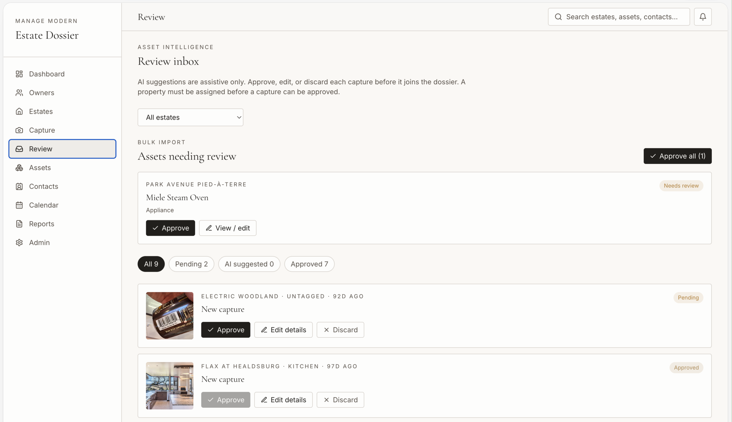
  • Reducing unnecessary review and approval steps in the upload experience

  • Establishing a clearer foundation for future data schema and feature development

Tools used: Lovable, Claude Code, Perplexity, Figma, GitHub, Vercel.

The evaluation lens

I reviewed early concepts against four practical standards:

Dimension Question
User value Does this help someone make a decision, complete a task, manage risk, or understand what requires attention?
Product integrity Does the feature reinforce Estate Dossier’s purpose, or does it drift toward generic software patterns?
System logic Does the information architecture and data structure support the V1 and the longer-term roadmap?
Operational simplicity Is the workflow proportionate to the risk, frequency, and importance of the task?

This made it possible to separate a good-looking prototype from a product that could actually be trusted, adopted, and extended.

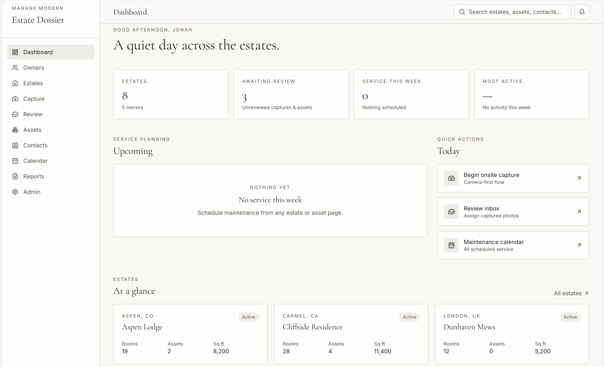
1. Replacing a data-rich dashboard with actionable priorities

One early AI-generated dashboard was visually polished. It used cards, charts, summaries, and activity highlights that created the impression of a comprehensive management platform.

The problem was that much of the information did not help the user make a decision or take action.

The interface elevated data because it was available—not because it was relevant. It risked creating cognitive load and making Estate Dossier feel like a generic dashboard rather than a reliable tool for managing an estate.

The issue

Severity: Major — Low-value information hierarchy
The dashboard highlighted information without connecting it to a meaningful decision, responsibility, risk, deadline, or next action.

The standard

Every top-level dashboard element should help answer at least one of these questions:

  • What needs my attention now?

  • What has changed?

  • What is at risk or overdue?

  • What decision is required?

  • What should happen next?

The correction

I reoriented the dashboard around actionable priorities:

  • Outstanding tasks and responsibilities

  • Meaningful changes to property, household, vendor, or document information

  • Deadlines and upcoming obligations

  • Exceptions, incomplete records, and potential risks

  • Clear ownership and next actions

Decorative or low-value data highlights were removed or demoted. The goal was not to show more information; it was to make the right information easier to act on.

2. Simplifying the homeowner, account, and contact model

A second issue was less visible but more consequential. The AI-driven prototype created an unnecessarily complex relationship among homeowners, user accounts, and contact information.

On the surface, the model appeared thorough. In practice, it risked creating ambiguity around identity, duplicate information, permissions, and the source of truth for sensitive personal details.

This is the kind of issue that can be easy to miss in an attractive prototype but expensive to correct after product development begins.

The issue

Severity: Blocker — Ambiguous identity and access model
The proposed structure conflated or over-separated the concepts of a person, their contact information, their login account, and their access rights.

The standard

A durable product model needs to distinguish between:

  • A person or homeowner record

  • One or more contact methods

  • A user account used for authentication

  • A person’s role within an estate or household

  • The permissions associated with that role

Those concepts should be related only where a genuine user need, privacy consideration, access rule, or future product requirement calls for it.

The correction

I simplified the information architecture to create clearer relationships among people, contact methods, user accounts, roles, and permissions.

The revised approach preserved flexibility for multiple estate participants while reducing unnecessary complexity in V1. It also created a more reliable foundation for future scenarios involving delegated access, household staff, advisors, family members, service providers, and varying levels of visibility into personal or estate information.

The result was a system that could grow without forcing complexity onto every user from day one.

3. Reducing an over-engineered upload-review process

The early prototype also proposed a detailed review process for uploaded images and data. The pattern was intended to create governance, but it introduced too much friction for routine intake.

Not every uploaded photo, document, or data point should trigger the same approval workflow. A process that treats all information as equally risky can make the product feel bureaucratic, slow, and difficult to use.

The issue

Severity: Major — Disproportionate workflow complexity
The upload flow introduced manual review requirements that were not justified by the typical risk or importance of routine information intake.

The standard

Controls should be proportionate to the consequence of an action.

Routine uploads should generally be:

  • Fast to complete

  • Attributable to the person who added them

  • Easy to edit, replace, or remove

  • Organized with lightweight metadata

  • Reviewable later when needed

Stronger review and approval controls should be reserved for genuinely sensitive, consequential, or shared information.

The correction

I simplified the workflow around direct upload, minimal required metadata, clear ownership, and the ability to review or edit information later.

The revised concept preserved stronger controls for cases where they mattered—for example, sensitive personal documents, information shared across multiple stakeholders, or changes that could affect important responsibilities. But it removed broad approval requirements that would have slowed everyday use without adding enough value.

This reduced friction while retaining the right level of trust, traceability, and governance.

What the work demonstrates

The Estate Dossier project illustrates a practical truth about AI-assisted design: AI can create credible first-pass patterns, but it does not inherently know which patterns fit a particular domain, support a product’s long-term model, or deserve the complexity they introduce.

AI-generated direction Review finding Corrected approach
Data-rich dashboard Attractive but not tied to user priorities or decisions Focused the dashboard on actions, changes, risks, deadlines, and next steps
Complex homeowner/account/contact structure Created ambiguity, duplication risk, and avoidable permissions complexity Clarified the relationships among person, contact method, account, role, and permission
Universal upload-review process Added procedural burden disproportionate to most uploads Used lightweight intake by default and targeted controls for higher-risk information

The outcome

The work established a more credible V1 foundation for Estate Dossier.

Rather than optimizing only for rapid feature generation, the product direction balanced immediate usability with the structures needed to support a longer-term roadmap. The resulting approach was more focused, easier to understand, and less likely to accumulate design or technical debt as the product evolves.

The goal was to apply the level of review that makes AI-assisted work genuinely useful:

Determine what is valuable, identify what is fragile or distracting, and document the corrected approach before an early prototype becomes an expensive constraint

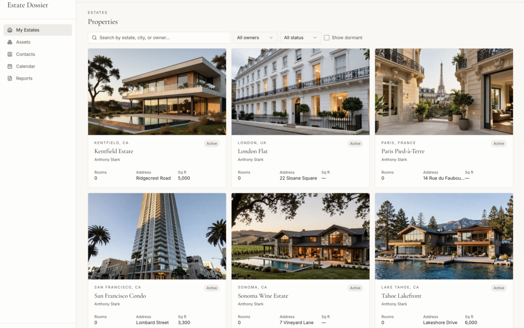
Screenshots from early prototype
Designing an AI-Enabled Fitness Companion

Designing an AI-Enabled Fitness Companion

TRX had a strong brand, respected equipment, and a large library of training content. The opportunity was to make its Training Club app more than a destination for workout videos—to turn it into a trusted, personalized fitness companion.

My work with TRX defined a near-future product vision, AI-enabled coaching model, and phased roadmap for evolving the app. A key part of the engagement was evaluating third-party large-language-model outputs related to TRX training, then using those findings to define where the TRX app could deliver more accurate, useful, and brand-specific guidance.

The central principle was simple:

Generic AI can generate fitness advice. A differentiated TRX experience must turn trusted TRX expertise, customer context, workout content, and performance data into guidance that is specific enough to act on.

The challenge

TRX equipment is used in homes, gyms, studios, and training programs, but equipment purchasers were not subscribing to the TRX Training Club at the rate the business wanted. The app’s content experience was not yet fully realizing the value of the TRX ecosystem: equipment, expert trainers, programming, community, and customer data.

The challenge was not merely to add an AI chatbot.

TRX needed to answer larger questions:

  • How could the app become more valuable after a customer had learned the basics?
  • How could it guide people toward specific goals rather than simply presenting a library of content?
  • What kinds of AI-powered recommendations would be credible, useful, and safe?
  • What customer, workout, equipment, and third-party data would be necessary to make recommendations meaningfully personal?
  • How could the business move toward an ambitious AI-enabled future without trying to build every capability at once?

My role

I guided the product vision and design strategy for a reimagined TRX Training Club experience.

My responsibilities included:

  • Conducting landscape and trend analysis across AI-enabled fitness, connected equipment, personalization, computer vision, and digital coaching
  • Evaluating third-party LLM-generated responses to TRX-related training questions
  • Identifying where generic model outputs were useful, incomplete, insufficiently contextual, or poorly aligned with the TRX training approach
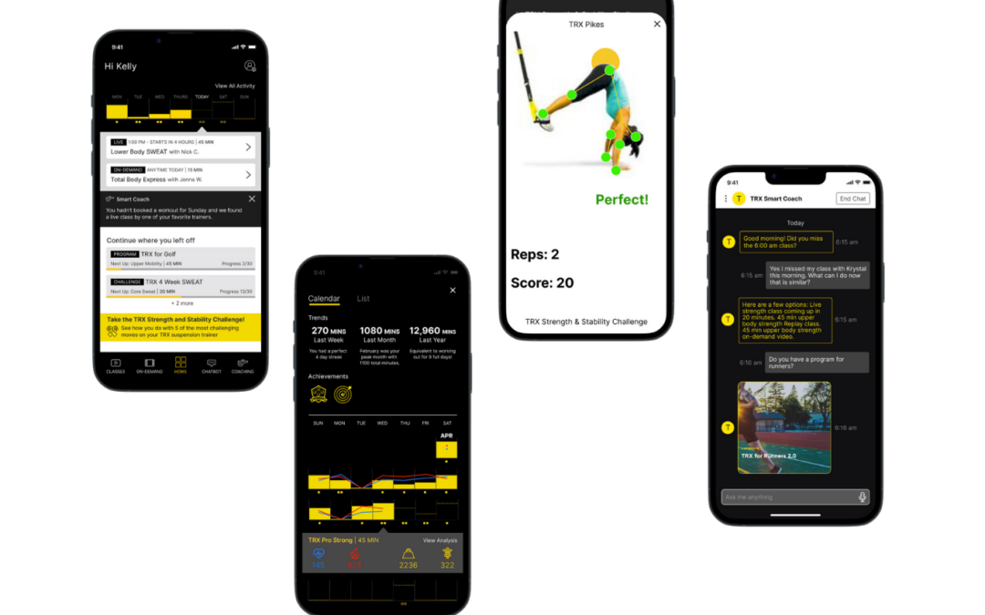
  • Defining product concepts and interaction patterns for a TRX Smart Coach
  • Creating a North Star vision prototype and strategic roadmap
  • Translating the vision into phased product capabilities, from foundational improvements to more advanced AI and connected-fitness features
  • Using the prototype and roadmap to align stakeholders, partnerships, and product-development conversations

The resulting vision repositioned TRX Training Club from a content-delivery app to a “Smart Coach” experience built around three strategic pillars: Content, Coaching, and Connection.

The opportunity

The proposed future state was a coaching companion that could help people:

  • Set and pursue fitness goals
  • Discover the right TRX and non-TRX workouts
  • Receive recommendations based on their goals, behavior, and available time
  • Build routines and adapt plans when circumstances change
  • Learn how to use equipment effectively
  • Track progress across TRX activity, connected equipment, wearables, and other fitness data
  • Access guidance that felt informed by TRX’s distinctive training expertise


The vision recognized that the market was moving toward connected equipment, wearable data, AI-guided programs, and increasingly personalized fitness experiences. But it also acknowledged a common customer problem: more data does not automatically create more value. Customers need help interpreting their data and deciding what to do next.


Evaluating third-party LLM outputs

At the time, third-party LLMs could respond to a wide range of fitness questions. For example, a user might ask for help preparing for a sport, improving mobility, preventing injury, selecting a workout, or adapting a missed class.

Those responses could sound confident and plausible. But a senior product review revealed important gaps.

The evaluation question

Could a generic LLM provide advice that was useful enough to serve as a trusted fitness coach inside the TRX experience?

The answer was: not on its own.

Generic models could offer broad training recommendations and conversational responsiveness. They did not inherently understand the customer’s TRX equipment, training history, fitness goals, content library, available time, physical constraints, instructor preferences, or recent workout behavior.

That distinction shaped the product strategy.


What the review revealed

Evaluation area Common limitation of generic LLM output Product implication for TRX
TRX-specific knowledge Advice could be broadly fitness-oriented but not reliably grounded in TRX methods, equipment, classes, or instructional content Ground recommendations in vetted TRX content, training knowledge, and approved program structures
Personal context Responses lacked a reliable view of the user’s goals, history, equipment, schedule, or recent activity Build a profile and activity layer that gives the coach relevant context
Actionability Advice often remained generic: helpful in theory but disconnected from a specific workout a user could start Connect conversational guidance directly to classes, programs, playlists, and next-best actions
Progression Generic outputs could recommend a workout, but could not reliably adapt an ongoing plan based on performance and progress Create a phased personalization engine that learns from goals, completion, feedback, and connected data
Trust and safety Fitness guidance needs appropriate boundaries, especially around injury, pain, form, intensity, and individual limitations Define clear scope, escalation behavior, and evidence-based TRX guidance rather than treating the model as an unrestricted expert
Brand differentiation A generic chat interface is easy to copy and does not create a distinct product advantage Make AI a delivery mechanism for TRX expertise, content, equipment, and coaching—not a novelty feature


The important finding was that conversational AI had value, but only when it was integrated into a broader product system.

A chatbot without trusted content, user context, and clear next steps would be an attractive demo. A Smart Coach connected to the TRX ecosystem could become a meaningful reason to subscribe.


Designing the TRX Smart Coach

The Smart Coach concept was designed as an AI-enabled layer within the app, not a standalone feature.

It could support several types of customer needs:

    • Finding a workout that fits a specific goal, available time, skill level, or equipment setup
    • Recommending an alternative when a live class is missed
    • Helping a user choose a program for activities such as running, golf, strength development, mobility, or recovery
    • Creating a personalized playlist from available TRX content
    • Supporting trainer matching or private-coaching pathways when automated guidance was not sufficient
    • Using data from connected equipment, wearables, and workout history to make future guidance more relevant

For example, rather than responding to “I missed my class—what should I do now?” with general exercise advice, the TRX Smart Coach could identify the missed class, understand the user’s goal and preferences, and offer specific alternatives from the TRX library: an upcoming live workout, an appropriate replay, or an on-demand class with similar duration and training focus. 

That is the difference between a generic answer and a product experience.


From data to action

The design vision emphasized a hierarchy of value: 

    1. Data — A raw fact, such as a heart-rate maximum or number of completed repetitions.
    2. Information — Organized or visualized data, such as a weekly performance trend.
    3. Knowledge — Context that helps a user understand what the information means.
    4. Insight — A recommendation that helps the user decide what to do.
    5. Wisdom — Guidance grounded in experience, judgment, and the person’s specific situation.

TRX could create a stronger customer relationship by moving beyond displaying activity data and toward delivering useful, timely guidance.

For instance:

    • Data: “Your maximum heart rate was 155 BPM.”
    • Information: “Your average effort was higher than similar recent sessions.”
    • Insight: “Your pace increased, but your recovery time was longer than usual.”
    • Action: “Keep the same load next session and extend rest intervals to remain in your target zone.”

The product opportunity was to combine TRX’s training expertise with customer context and connected data to make this level of guidance accessible at scale.


Product design principles 

The vision established several principles for AI-enabled product development.

AI must improve a real decision

The product should not surface data, recommendations, or conversation merely because it can. Each interaction should help the customer choose a workout, adapt a routine, understand progress, or take an appropriate next step.

Context determines usefulness

A useful recommendation depends on the customer’s goals, current plan, available equipment, training history, schedule, preferences, and recent activity. AI without context is generic; AI with the right context can feel like coaching.

Content must be discoverable and actionable

A large content library creates value only when customers can find the right content quickly. Search, filtering, personalization, clear metadata, and contextual recommendations were foundational—not secondary—to the future Smart Coach experience.

AI should be grounded in TRX expertise

TRX’s value was not simply that it could offer another conversational interface. Its advantage was the combination of established training knowledge, recognized trainers, equipment-specific guidance, programming, and customer relationships.

The roadmap must earn complexity

Computer vision, form analysis, connected equipment, external-data integrations, and hyper-personalized programming were compelling future opportunities. They were not all V1 requirements. 

The roadmap separated foundational work from more ambitious capabilities so the team could improve the current app while building toward a differentiated future.


The roadmap

The vision outlined a three-phase evolution.


Phase Product focus Key capabilities
Phase 1: Condition Improve the existing app experience and establish the foundation for future intelligence Content discovery, targeted programming, workout planning, basic goal setting, recommendation engine, basic insights, chatbot, heart-rate integration, health-data connections, connected-strap integration
Phase 2: Compete Increase engagement and establish TRX as an ongoing fitness companion More personalized programming, challenges, richer analytics, notifications, badges, deeper recommendations, evolving chatbot, virtual-private-trainer MVP, trainer scheduling and communication
Phase 3: Conquer Make TRX a central hub in the customer’s health and fitness ecosystem Advanced Smart Coach capabilities, deeper personalization, computer-vision form analysis, virtual coaching, connected equipment, third-party fitness integrations, community, and intelligent in-app commerce

The phased plan made it possible to pursue an ambitious vision while grounding early investment in improvements to conversion, retention, engagement, discoverability, and customer value.


What this work demonstrates

This project was not an exercise in adding AI to a fitness app. It was an evaluation and product-design effort focused on defining what AI needed to do—and what systems needed to exist around it—for the experience to be credible.

Challenge Design judgment applied Result
Generic LLM answers sounded helpful but lacked TRX context Evaluated outputs for specificity, accuracy, actionability, product fit, and user value Defined the need for TRX-grounded coaching rather than a generic chatbot
A large workout library was difficult to navigate Connected content strategy, metadata, search, filters, and recommendations Positioned content discovery as a prerequisite for personalization
Fitness data could become overwhelming Distinguished raw metrics from actionable insight Designed toward contextual guidance rather than passive dashboards
Advanced AI and connected-equipment concepts were compelling but complex Evaluated capabilities against feasibility, user value, and roadmap dependency Created a phased path from foundational product improvements to advanced Smart Coach features
TRX needed a stronger reason for customers to subscribe and stay engaged Linked AI features to the core customer journey and TRX’s proprietary strengths Reframed Training Club as a coaching companion rather than a video library


The outcome

The North Star vision prototype, strategic narrative, and roadmap gave TRX a coherent direction for evolving Training Club into an AI-enabled fitness platform. The materials were used to support stakeholder alignment, partnership discussions, and product-development planning.

More importantly, the work clarified a product principle that remains relevant as AI capabilities accelerate:

The value of AI is not the ability to produce an answer. The value is the ability to provide the right guidance, grounded in trusted expertise and meaningful context, at the moment a customer needs to act.


For TRX, that meant moving beyond content delivery toward a product experience that could help every customer train with more clarity, confidence, and continuity.


Designing Trusted, Personalized Guidance for Digital Banking

Designing Trusted, Personalized Guidance for Digital Banking

Personalization can make digital banking more useful—but financial guidance is not like a product recommendation or a content suggestion.

When a bank uses a customer’s financial information to offer advice, the experience must earn trust. The advice has to be relevant, timely, understandable, and appropriate to the customer’s situation. It must also avoid the opposite failure: feeling invasive, presumptuous, or overly automated.

My work with BBVA combined two related challenges:

  1. Create a modular online-banking design system that could serve common customer needs across 11 markets while allowing for local variation.
  2. Explore how personalized, AI-enabled guidance could help customers make better financial decisions without undermining trust in the bank or creating concern around the use of sensitive financial data.

The result was a product direction that treated personalization as a design and trust problem—not simply a data or technology feature.

The challenge

BBVA’s banks in 11 countries faced similar digital-banking needs, but each market had its own product requirements, customer expectations, and local operating realities.

The immediate design challenge was to create a modular online-banking system that could meet approximately 80% of shared user needs while enabling local teams to adapt the remaining 20%.

At the same time, the organization was exploring the potential for more personalized financial guidance. The question was not whether a system could analyze banking data. The real questions were:

  • Would customers trust the bank to use their financial information in this way?

  • What types of advice would feel helpful rather than intrusive?

  • Which moments in a customer’s journey created a legitimate reason to offer guidance?

  • How could the experience communicate why a recommendation was being made?

  • Where should the product support a decision, and where should it avoid overstepping?

These questions were especially important because banking information is deeply personal, and advice can influence consequential customer decisions.

My role

I led work across customer research, UX design, systems design, prototyping, and strategic narrative.

My responsibilities included:

  • Guiding a modular online-banking design system for use across 11 BBVA markets

  • Facilitating research into customer trust, expectations, and concerns around personalized financial advice

  • Exploring which types of guidance customers considered relevant and credible

  • Identifying the moments when customers would be most receptive to advice

  • Translating research findings into product concepts, interaction patterns, and design-system implications

  • Helping align teams around a common approach to scalable customer experiences and localized implementation

  • Supporting the transition from vision and prototype work into product-development decisions

The opportunity

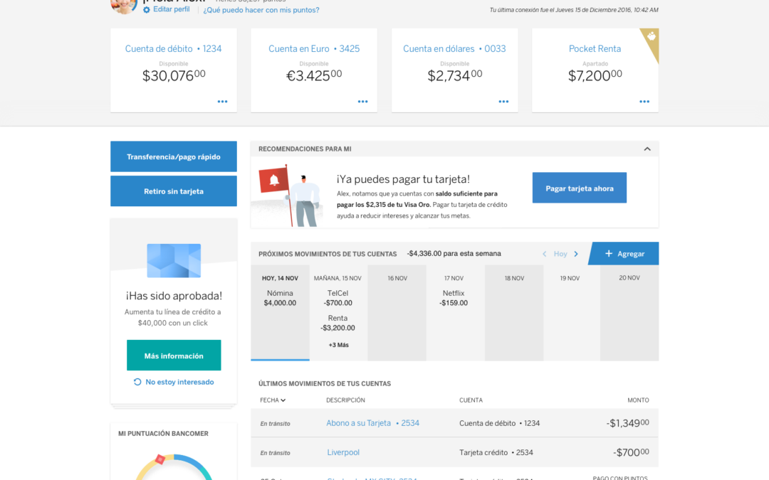
Traditional online banking often presents customers with balances, transactions, account details, and static product information. It gives them access to data but leaves much of the interpretation and decision-making to the customer.

The opportunity was to make the banking experience more useful by helping customers understand:

  • What has changed in their financial situation

  • What action may be useful or urgent

  • Whether they are progressing toward a goal

  • Where they may be at risk of a fee, missed payment, low balance, or other avoidable issue

  • Which financial products or behaviors might better support their stated priorities

The design challenge was to turn personal financial data into relevant guidance while retaining customer agency and trust.

Researching trust in AI-driven advice

Customer research focused on the emotional and practical conditions that determine whether personalized guidance is welcome.

The finding was not that customers wanted constant advice. They wanted help that felt earned.

Customers were more likely to trust guidance when it was:

  • Clearly tied to information they recognized and understood

  • Relevant to a current goal, recent behavior, or imminent decision

  • Specific enough to be useful, but not so directive that it felt controlling

  • Transparent about why it was being presented

  • Easy to ignore, dismiss, or explore further

  • Framed as support for the customer’s decision—not a demand or sales pitch

  • Consistent with the bank’s role as a trusted steward of sensitive information

Customers were less likely to welcome guidance when it appeared disconnected from their immediate needs, surfaced without explanation, felt overly promotional, or implied that the bank was monitoring every detail of their financial life.

That research reframed the work. Personalized advice had to be designed as a permission-based, contextual experience.

Defining appropriate advice

Not all advice carries the same level of sensitivity or risk. The team explored a range of guidance types and the conditions under which each would be appropriate.

Type of guidance Example customer value Appropriate conditions
Awareness “Your balance is lower than usual for this point in the month.” When the signal is clear, timely, and based on information the customer can recognize
Prevention “An upcoming payment may put this account below your preferred balance.” When there is a concrete, near-term risk and the customer has time to act
Progress “You are on track toward the savings goal you set.” When the customer has explicitly established a goal or preference
Education “Here is how this transaction category affects your monthly spending picture.” When customers need context, not a directive
Recommendation “Based on your stated goal, you may want to explore this savings option.” When the recommendation is relevant, explainable, optional, and clearly distinguished from impartial guidance
Escalation “Would you like to speak with an advisor?” When the decision is complex, high-value, emotionally sensitive, or outside the boundaries of automated guidance

This framework helped distinguish assistance from intrusion. It also provided a practical basis for deciding what should be automated, what should be explainable, and what should remain a human-advisor conversation.

Designing for the right moment

Personalized guidance is only useful when it arrives at a moment when the customer can understand and act on it.

The work examined several moments where advice could have a legitimate role:

  • When a customer logs in and a meaningful change requires attention

  • During a transaction or payment flow, before an avoidable consequence occurs

  • After a pattern becomes clear enough to support a useful observation

  • When a customer is reviewing spending, savings, or progress toward an explicit goal

  • When a customer has missed a payment, encountered an unexpected event, or needs help recovering

  • When a customer asks a question or expresses an intent that signals they want help

The key was not to make the dashboard louder. It was to make the advice more situational.

For example, a generic prompt such as “Explore ways to save more” may be easy to dismiss. A contextual message such as “Your utility payment is scheduled tomorrow, and the available balance in this account is below the amount you typically maintain” provides a clear reason for appearing and gives the customer an opportunity to act.

Product design principles

The exploration established several principles for trusted financial guidance.

Advice must be explainable

Customers should understand the basis for a recommendation. If a product cannot communicate why it is surfacing a message, it should question whether the message belongs in the experience.

Timing is part of the product

Even helpful advice can become irritating or alarming when it appears at the wrong moment. Guidance should be connected to a decision, a meaningful change, a stated goal, or an opportunity to prevent a negative outcome.

Customer control protects trust

Customers need the ability to explore, defer, dismiss, adjust preferences, or seek human support. Personalization should feel like assistance, not surveillance.

Guidance and sales must remain distinct

A product recommendation may be appropriate, but it should not masquerade as neutral financial advice. The experience should clearly distinguish educational support, risk alerts, personalized insights, and commercial offers.

The system must support consistency at scale

If personalized guidance is introduced across markets, the underlying patterns for explanation, timing, escalation, preference management, and user control need to be coherent. The modular system made it possible to define those patterns centrally while allowing local teams to adapt them responsibly.

Building a scalable system

The broader design-system work created a common foundation for digital banking across BBVA’s country operations.

The system was designed to support around 80% of shared user needs across 11 markets, while allowing local teams to address the remaining 20% based on market-specific requirements.

This approach was especially valuable for personalization. A bank can only introduce trusted guidance at scale if core interaction patterns remain consistent:

  • How an insight appears

  • How customers understand its basis

  • How a recommendation links to an action

  • How customers manage preferences

  • How exceptions and higher-risk scenarios are handled

  • When the experience escalates to a human advisor

  • How local teams adapt language, products, regulations, and market conditions without undermining the underlying customer experience

The design system was not simply a library of interface components. It was a way to create shared standards for decision-making, implementation, and customer trust.

The outcome

The BBVA system work improved the organization’s ability to move product ideas into implementation across markets.

During a roadshow, BBVA Mexico identified a feature it had been unable to implement for 18 months. The modular approach resolved the challenge, leading Mexico to adopt the broader system and launch the feature within three months.

The work also established a more thoughtful basis for personalized banking experiences. Rather than treating AI-driven advice as a generic feature, the concepts emphasized the conditions that make guidance worthy of customer attention:

  • It addresses a meaningful customer need

  • It appears at an appropriate moment

  • It is grounded in understandable information

  • It respects the sensitivity of financial data

  • It preserves customer choice

  • It knows when a human advisor is the better next step

What this work demonstrates

Challenge Design judgment applied Result
Shared banking needs across 11 markets Identified what should be standardized and where local flexibility was essential A modular system designed to address roughly 80% of common needs
Personalized guidance using sensitive financial data Researched customer trust, expectations, and boundaries A trust-centered approach to financial insight and advice
AI-generated or data-driven recommendations Evaluated relevance, explainability, timing, customer control, and appropriate escalation A framework for helpful guidance rather than intrusive automation
Financial advice can have real consequences Distinguished low-risk awareness from higher-stakes recommendations Clearer boundaries for automation, education, product offers, and human support
A feature stalled for 18 months in Mexico Applied the modular system to a concrete local need Feature launched within three months after adoption of the system 

The core lesson

In financial services, personalization is not valuable because a system can analyze data. It is valuable only when customers believe the guidance is relevant, understandable, respectful, and in their interest.

The goal was not to make online banking more automated.

It was to make it more trustworthy, more useful, and better able to help customers act with confidence.